The Perceptual Rules That Shape Great Cities
Using Gestalt psychology to explain why some streets feel effortless and others feel exhausting
Why do some streets feel calm and cohesive while others feel overwhelming and chaotic? Why do certain places invite people to linger while others feel barren and uncomfortable?
The answer lies in understanding the invisible rules that govern human perception, known as Gestalt principles.
Gestalt psychology emerged in the 20th century as a means to explain the inherent tendency of humans to seek order and simplicity in visual scenes. Its central insight, developed by Max Wertheimer, Kurt Koffka, and Wolfgang Köhler, was the law of Prägnanz, which states that when we perceive complex images, our brains instinctively reduce them to their simplest and most stable forms. In short, we group, we complete, we simplify, seeking order out of chaos.
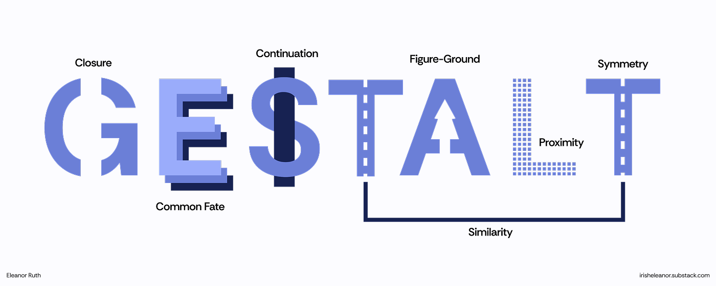
The Gestalt principles are a set of rules our minds follow in order to organize perception. In urban environments, these principles determine whether a street feels chaotic or coherent, exhausting or energizing. These are similarity, common fate, proximity, figure-ground, closure, continuation, and symmetry.
Collectively, these principles explain how our brains streamline visual processing, enabling rapid and intuitive interpretation of complex visual stimuli.
Urban environments are among the most complex visual scenes humans navigate. They must be parsed rapidly, often while moving. A missed sign, a misread intersection, or a misunderstood warning can have dire consequences. Cities can be thrilling when they break from Gestalt principles, but in daily life we usually prefer the ease of order. Environments that align with Gestalt principles are easier for us to read and inhabit while those that don’t can feel exhausting.
Similarity
Some of the Gestalt principles are fairly intuitive, like similarity, which describes the tendency to perceive objects that share visual characteristics as belonging together. Similarity is one of the simplest cues our brains rely on. We group things that look alike, compressing variations into a single category. In urban design, similarity comes from repeated forms, colors, materials, or textures.
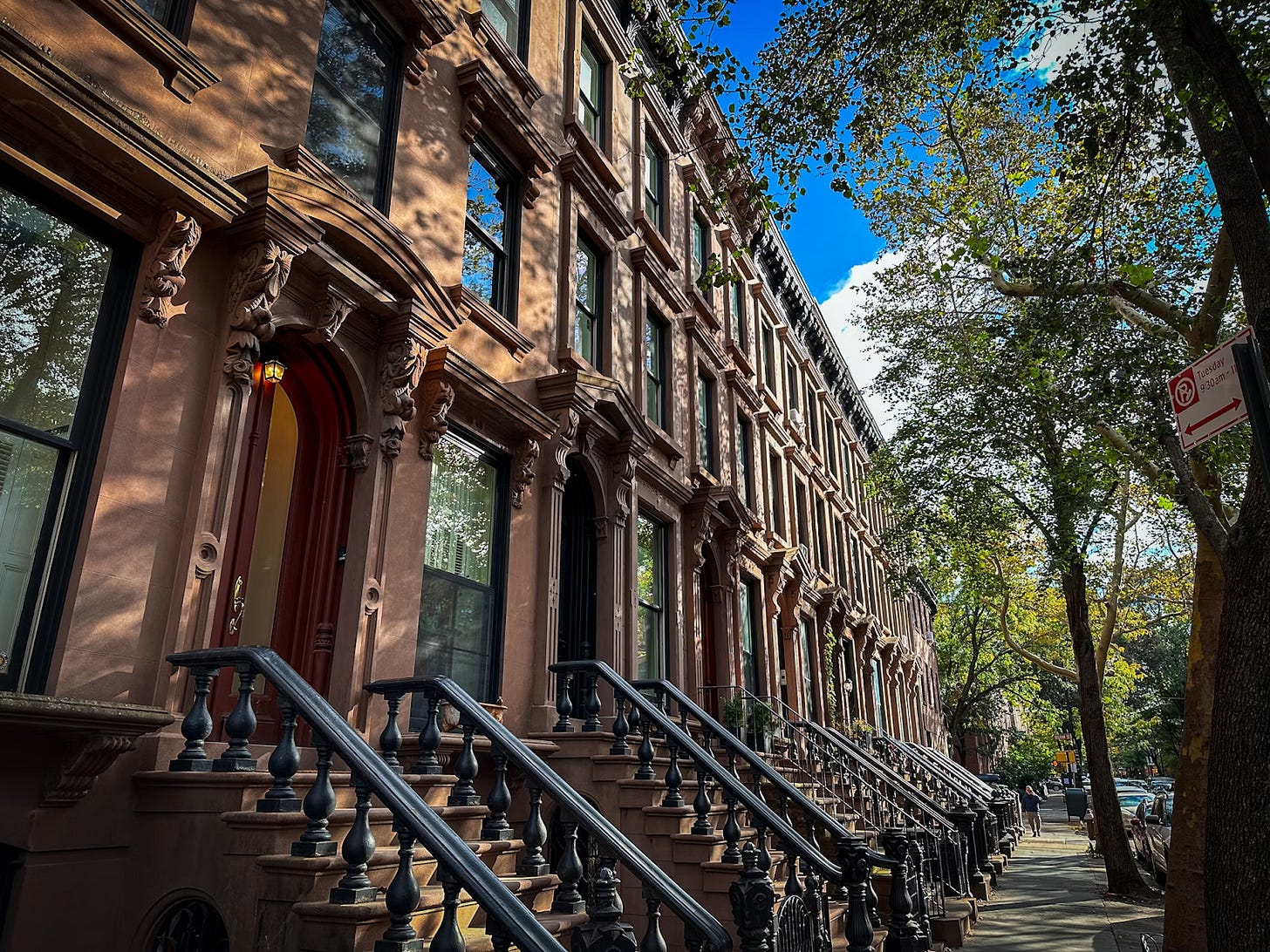
This is why terraced housing in London or brownstones in Brooklyn read as a continuous fabric. Rooflines, cornices, and window rhythms repeat; even accounting for differences in paint or door knockers, the repetition dominates, making the street legible as one piece of architecture stretched across blocks.
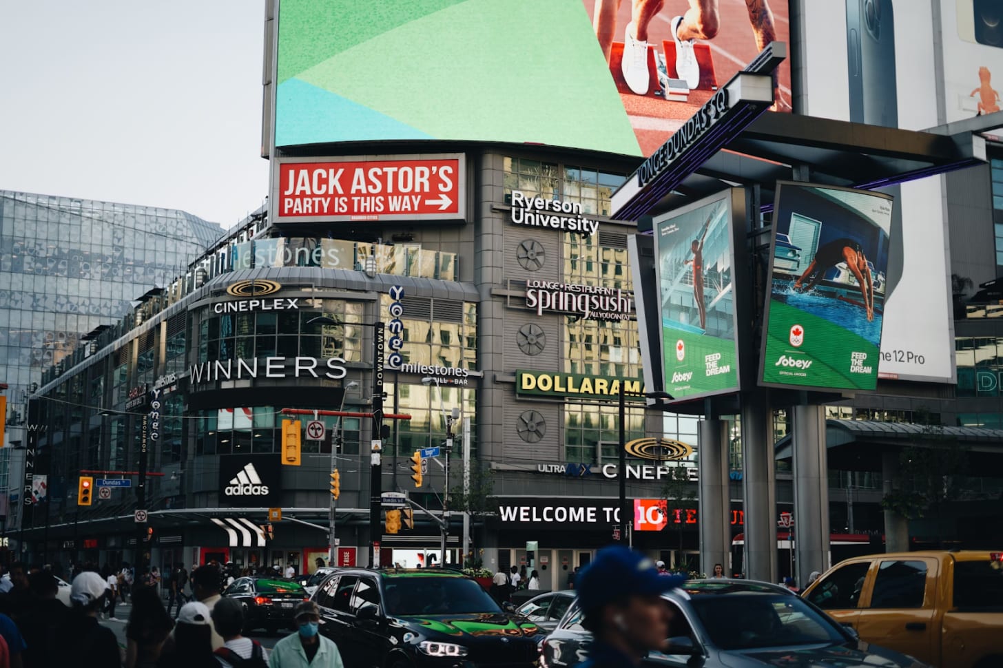
When similarity is broken the eye has to start over with every building, which carries with it high cognitive costs. In Toronto’s Yonge-Dundas Square, every building surface competes with billboards, digital screens, and mismatched façades. Nothing shares a rhythm or palette, so the brain cannot group elements into a whole. The result is fragmentation, a space that feels more like visual noise than architecture. A suburban street built piecemeal has the same problem. One house is faux-Medieval, another a gabled McMansion, the next a flat-roofed modernist box, with no shared rooflines and no material palettes. Instead of a street, you see a catalogue of unrelated experiments as each building insists on its own style, so it never resolves into a coherent figure. The absence of similarity means the brain cannot compress them into a whole.
Common Fate
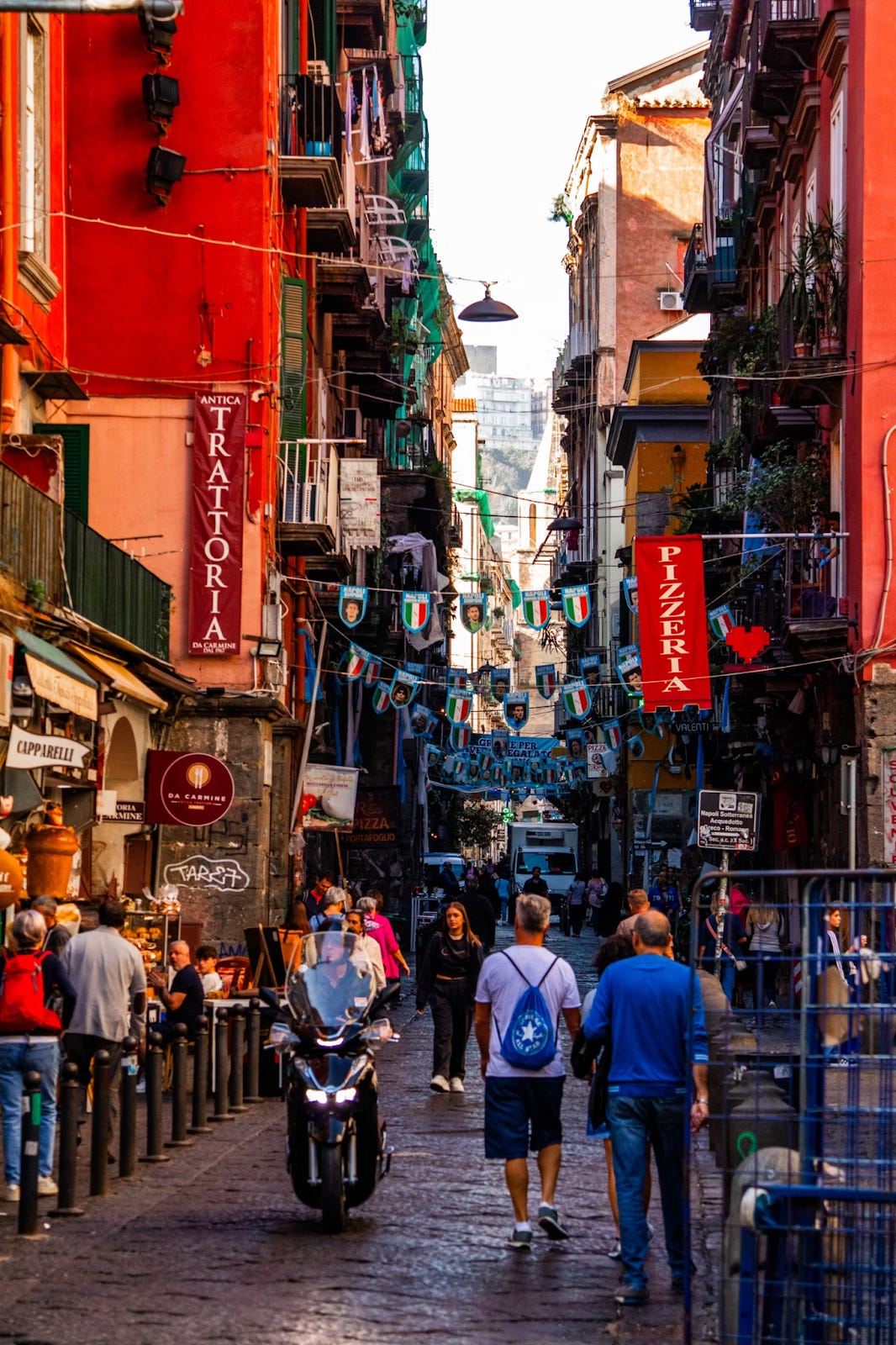
While some Gestalt principles such as similarity are fairly intuitive, common fate may be more alien, extending Gestalt into the fourth dimension. This principle explains that elements moving or aligned in the same direction, even if they look different, are perceived as part of the same group. Thus extending our perceptual rules into time. Watch a murmuration of starlings: thousands of birds, one shape. In cities, this most often applies to the alignment of buildings, the rhythm of street furniture, and the overall flow of pedestrians and traffic.
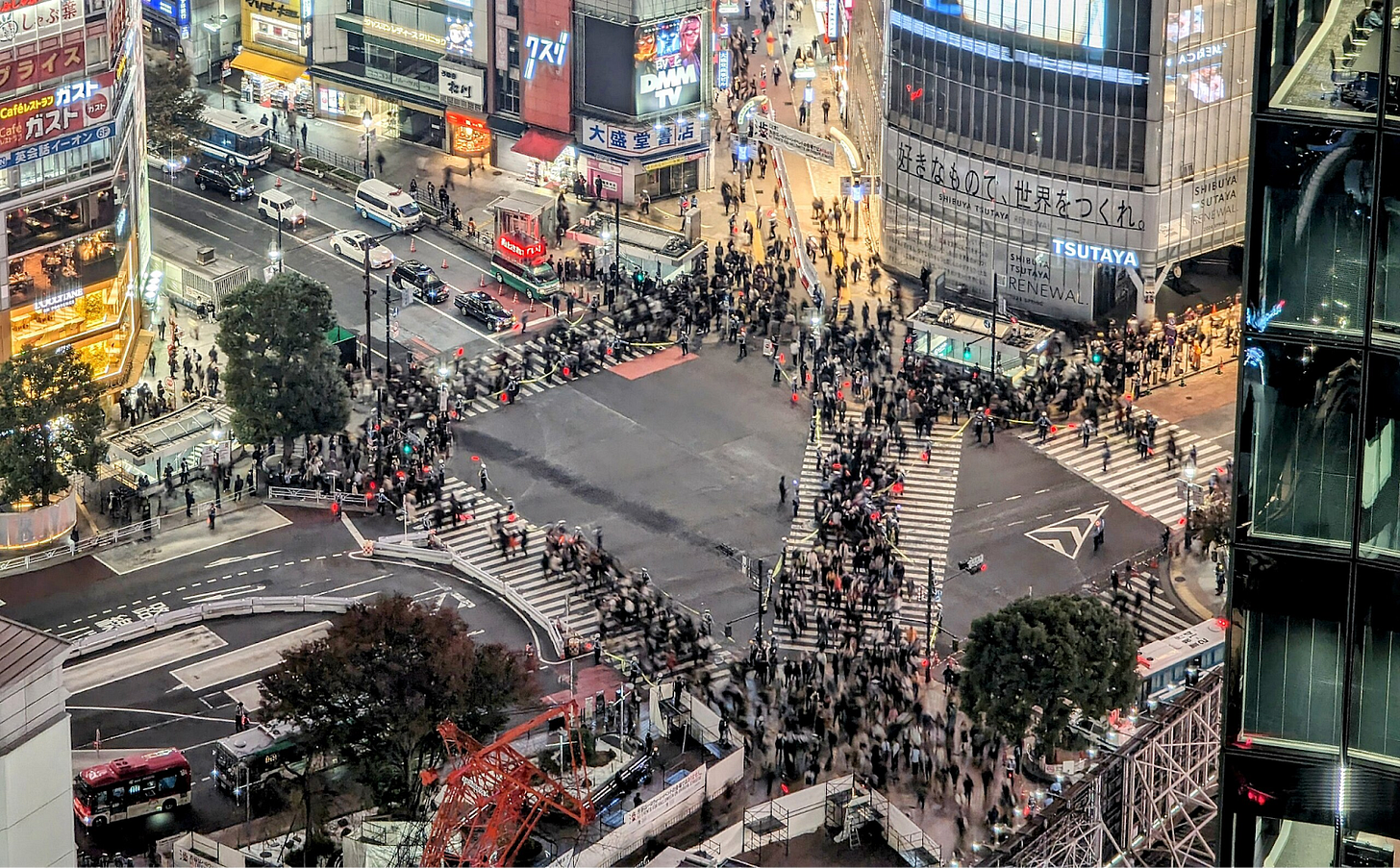
At Shibuya Crossing in Tokyo, hundreds of people move at once when the scramble light turns green. The sheer density could feel chaotic, but because everyone steps forward together, the motion resolves into choreography as the crowd becomes one figure. Traffic systems exploit the same cue: green-wave light sequences down Manhattan avenues let cars move as a single flow. Even though there are dozens of vehicles, the shared speed and direction reads as a unit.
When common fate breaks down, spaces feel chaotic. Shared-use paths in many cities show this clearly: cyclists rush past joggers, dog walkers drift unpredictably, all while people sit down to share a leisurely lunch. This disorder carries with it its own charms but because no dominant flow emerges, the eye cannot group the movement into a whole. Each trajectory feels separate, and the result is stress and disorientation. Airports often produce the same effect, as luggage carts, business travelers, and children all move at conflicting speeds through the same corridor. The scene reads as a collision rather than choreography.
Proximity
Proximity refers to the way we group elements that are physically close together. In the urban context, it shapes how we read clusters of buildings, street furniture, and architectural features.
Traditional Kyoto shows the effect clearly. In Higashiyama, machiya townhouses line the street in narrow frontages that measure only a few meters wide. Each has its own lattice screens or tiled eaves, but the gaps between them are so slight that the eye fuses the line into a single structure. This closeness forms a continuous edge, making the street feel like one cohesive fabric built from many parts.

Modern Kyoto breaks this rhythm. Postwar zoning allowed concrete mid-rises, small parking lots, and isolated infill to interrupt the sequence. A machiya might sit beside an empty lot, followed by a tower out of scale with its neighbors. The spacing is too wide and irregular for the mind to compress. While some of the individual buildings still hold historic beauty, what once read as a coherent street dissolves into fragments, making the environment feel more like a collage than a fabric.
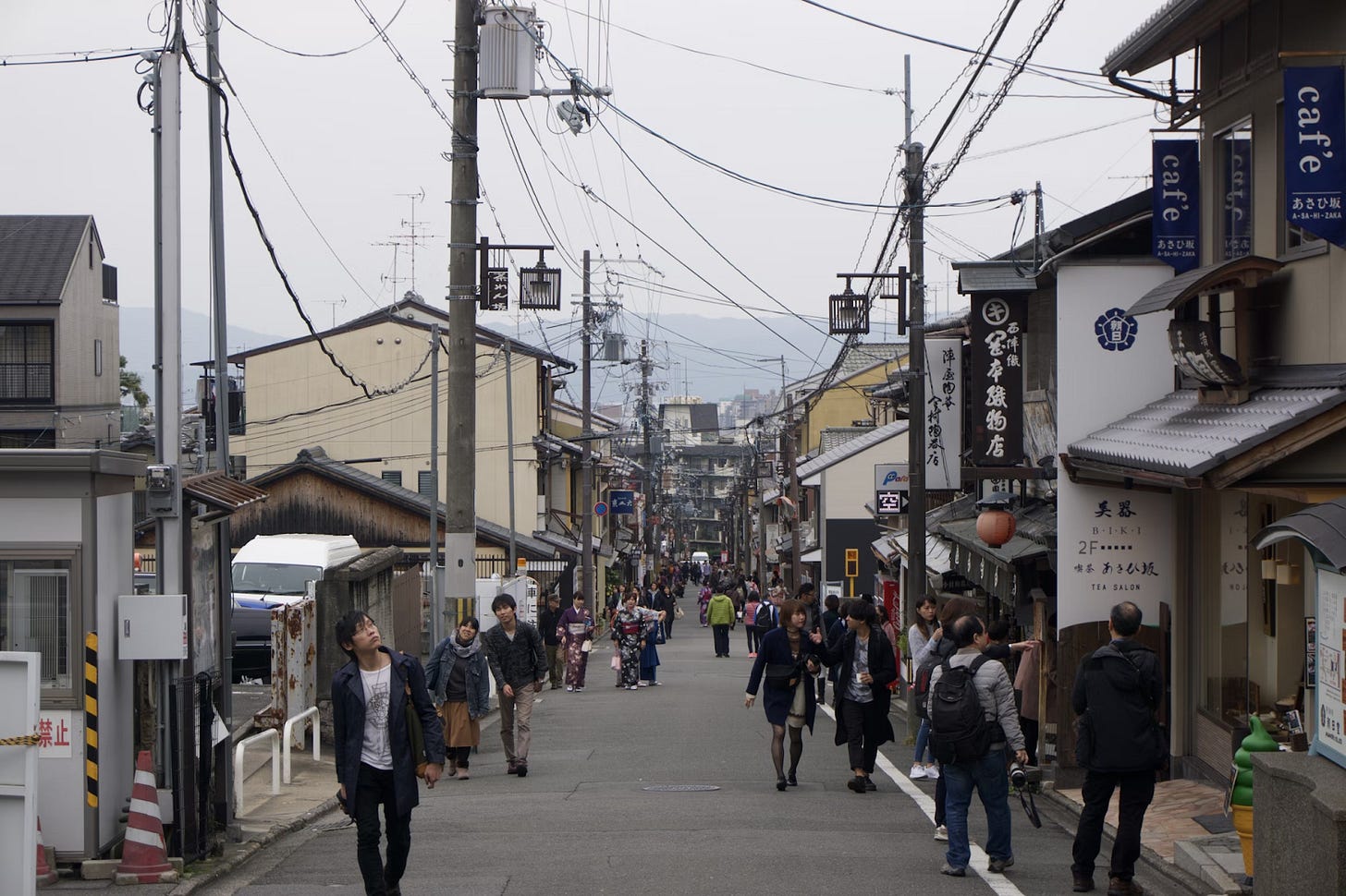
Figure-Ground
Figure-ground is the grammar of solids and voids, explaining how we separate focal objects, those that are close by from the background. A city becomes legible when this contrast is sharp enough that you can “read” the urban landscape.
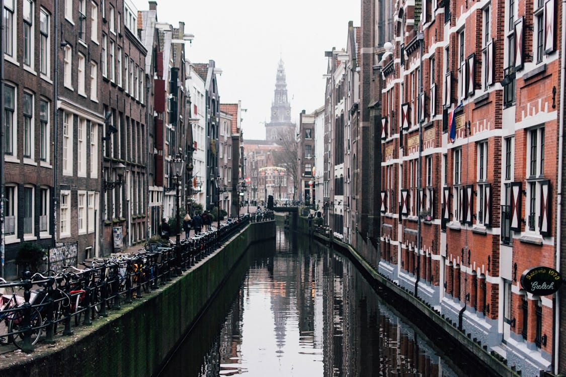
In Amsterdam, this legibility is achieved through narrow canal houses that stand shoulder to shoulder, forming an almost unbroken wall of architecture. The canals themselves cut through as voids, providing legible corridors of space. Because the two roles never blur, the buildings are always figure, the water always ground, the city feels immediately legible, even to first-time visitors. You can navigate simply by following the voids.
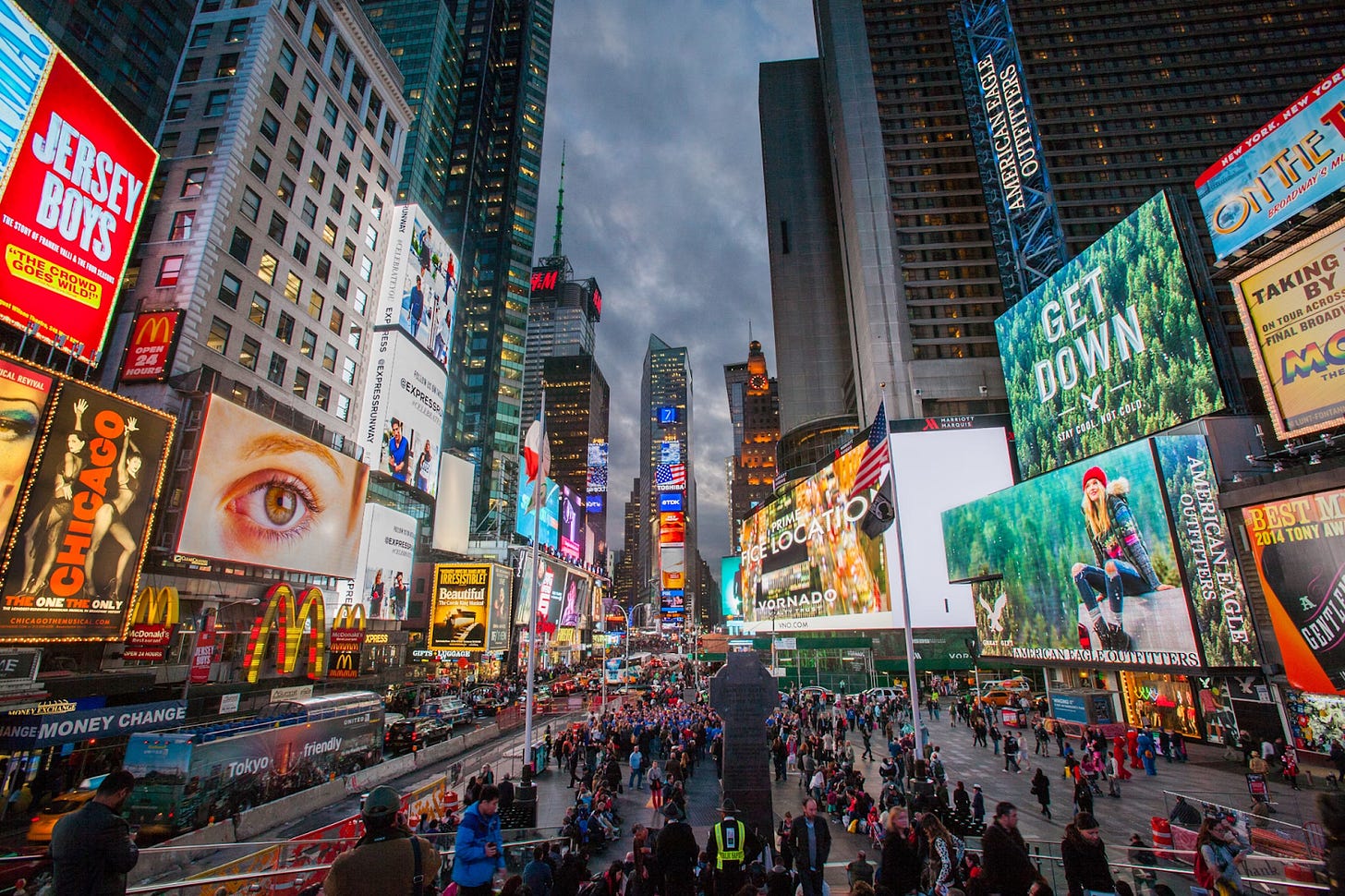
Times Square, by contrast, collapses the figure-ground distinction. This gives a sense of overstimulation that is thrilling for a visit but can be taxing to inhabit as it requires the eye to constantly search for order in a field of shifting signals. Buildings dissolve into screens and facades are no longer solids but glowing surfaces. The figures are the shifting images themselves, while the ground (part road, part pedestrian plaza, part crowd) never stabilizes. The signage itself competes aggressively, pushing itself further to the front, flattening all in its path. Without figure-ground clarity, environments become unstable: more blur than architecture.
Closure
Closure describes the mind’s tendency to complete incomplete shapes. When buildings and streets are designed in a way that supports closure, pedestrians can understand their surroundings quickly and without strain.
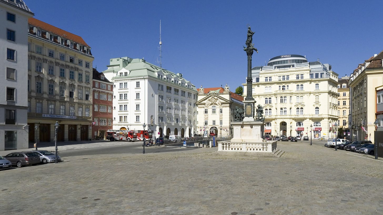
A square in Vienna might be framed by three historic facades and one side left open to a street. Yet you still experience it as an enclosed environment. The mind obligingly supplies the missing edge. Closure creates psychological comfort so that you feel contained even without a literal boundary.
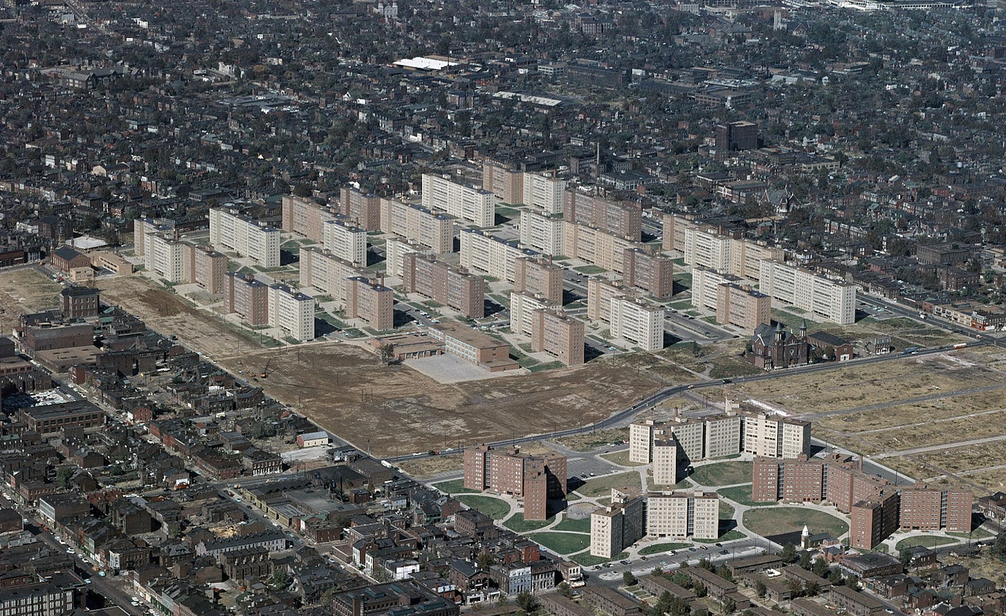
When closure is absent, spaces feel exposed and unfinished. The Pruitt-Igoe housing project in St. Louis made this mistake on a massive scale. Towers were set in open fields with no street walls, no enclosing edges, nothing for the eye to complete. Instead of courtyards or rooms, residents were left with voids that leaked in all directions. The result was not community space but leftover space-indefinite, illegible, and alienating. Without closure, the project never cohered, and its famous demolition became a symbol of modernism’s urban failures.
Continuation
Continuation is our preference for smooth, uninterrupted patterns over abrupt changes that carry the eye forward. When a street supports continuation, the gaze flows naturally along its lines, and movement through space feels effortless.
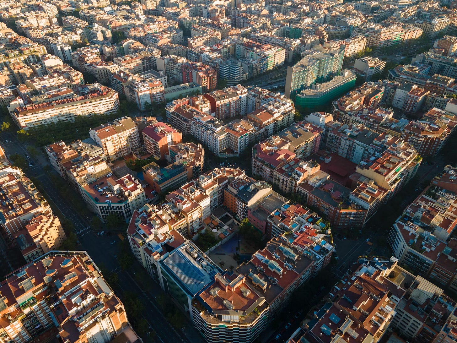
Barcelona’s Eixample district exemplifies continuation with a sense of mathematical precision. Laid out by Ildefons Cerdà in the mid-19th century as an extension of the city’s medieval core, the grid is composed of blocks, each measuring 113 meters square. It was designed for hygiene and circulation, but it also created an enduring feeling of flow. Long, straight, tree-lined avenues stretch to the horizon, facades rise in steady alignment, and chamfered corners keep intersections open without breaking the rhythm. Balconies and cornices repeat block after block, so the eye is carried forward in a single sweep. This visual propulsion gives structures to the city, so that while walking or driving, you feel Barcelona pulling you along its lines.
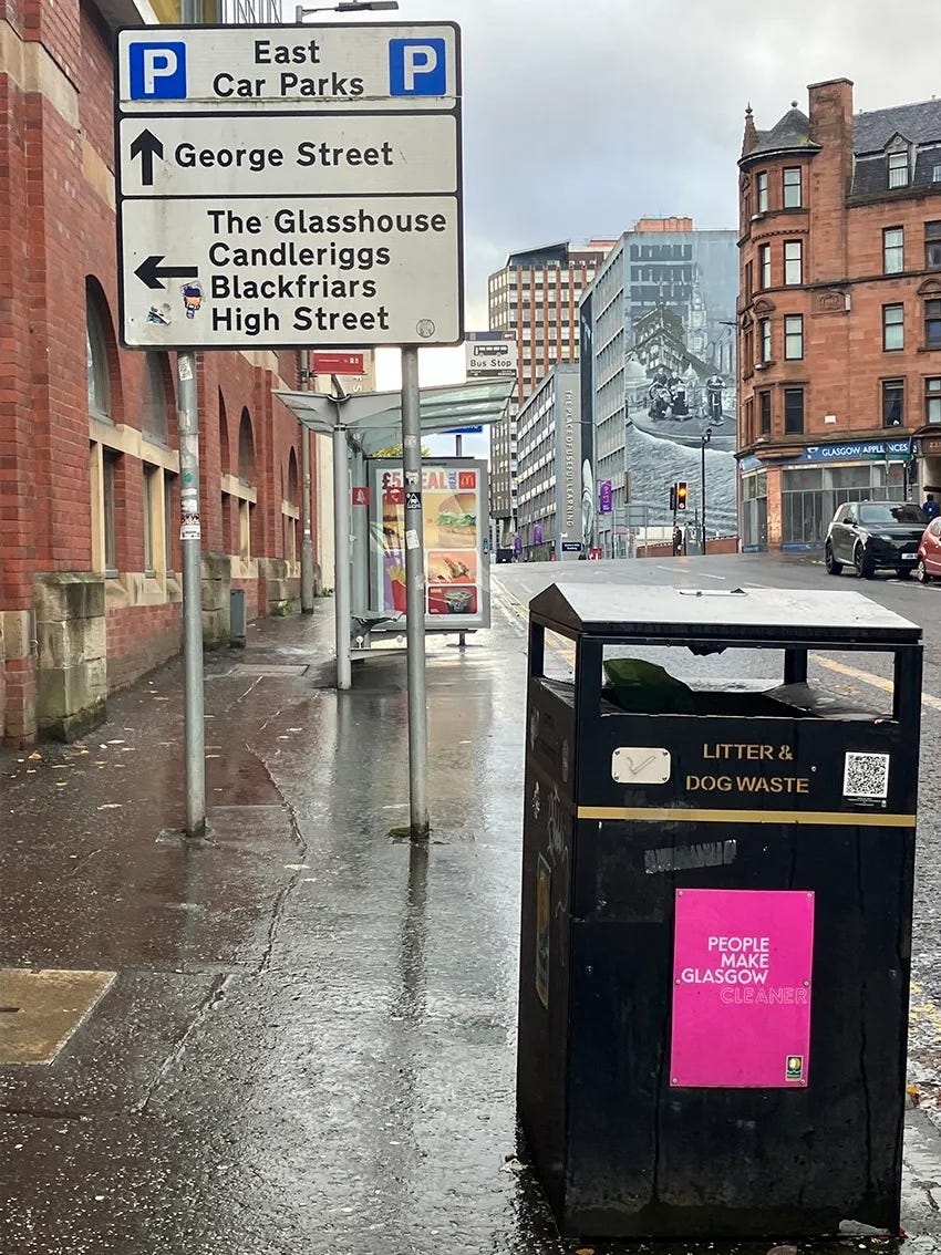
However, while cleverly deployed in many cities, continuation is one of the most commonly overlooked Gestalt principles. When continuation is broken, navigation becomes less intuitive. A bus stop placed mid-sidewalk, a bin blocking a sightline, or an abrupt change in setback forces the pedestrian to refocus. Many modern cities fall victim to this problem, with competing interests such as the need for wayfinding and shelter for public transport users overriding good design sense.
Symmetry
Symmetry is perhaps the most intuitive of the Gestalt principles, describing the tendency to find balanced forms easier to interpret. From childhood we develop a preference for symmetric visual patterns which follows us into adulthood. In built environments, balanced facades and skylines create stability and order.
This is why many government buildings favor symmetrical styles. The U.S. Capitol, with its central dome and mirrored wings, embodies this as does the Lincoln Memorial. The symmetry reassures those that look upon it that here is order, here is permanence. Classical architecture leaned on symmetry because it made authority instantly obvious. Washington, D.C. as a whole amplifies this effect: its ceremonial axes, mirrored façades, and neoclassical monuments project a capital city built to signal stability.

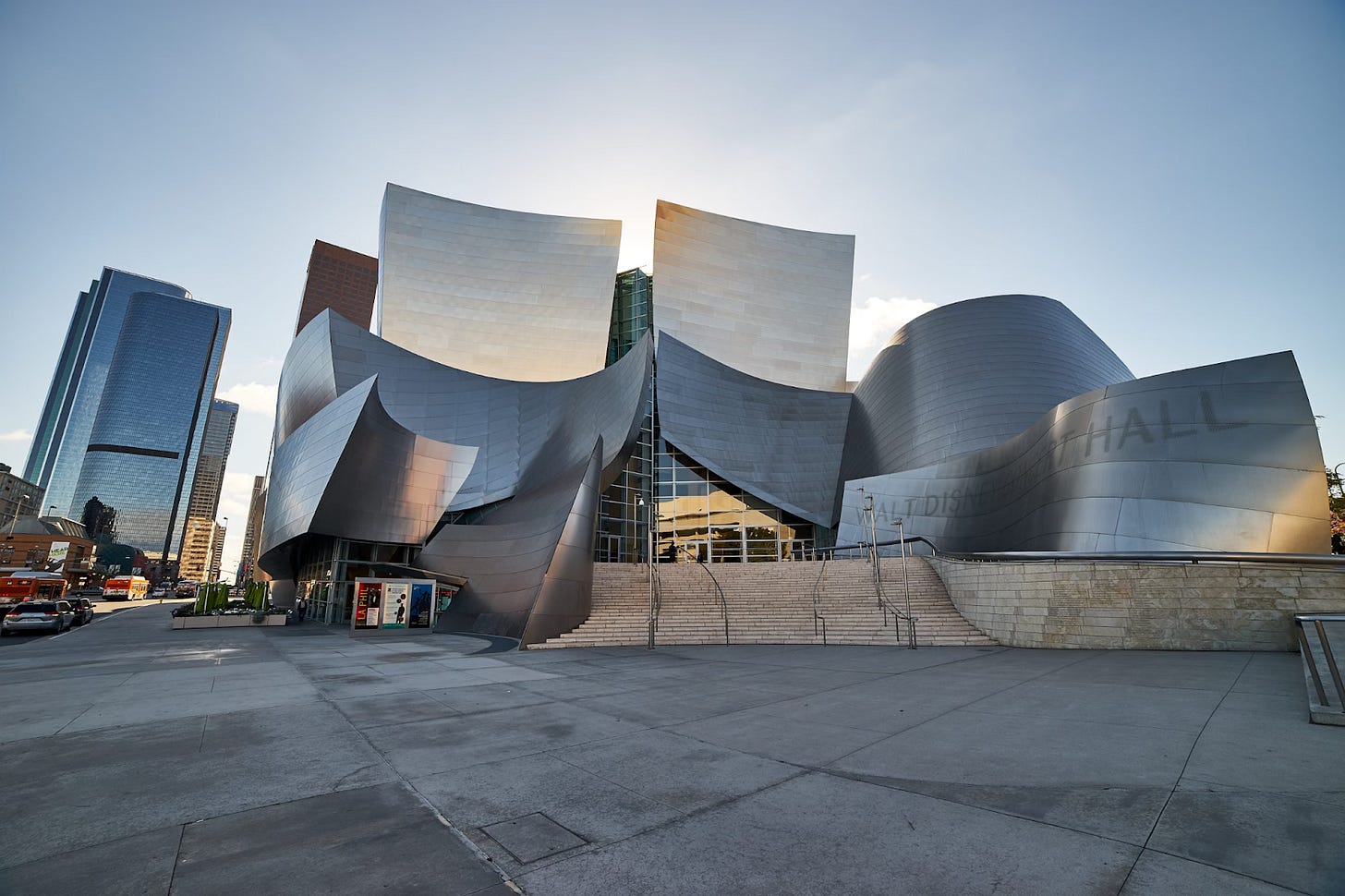
Bunker Hill in Los Angeles does the opposite. Towers rise at different heights and orientations, podiums meet the street at odd angles, and plazas open without clear edges. At its center sits the Walt Disney Concert Hall, designed by Frank Gehry, who employed his trademark vocabulary of twisting forms and colliding curves. The building mesmerizes, but it resists resolution: there is no axis, no mirrored halves, no equilibrium for the eye to settle on. While symmetry reassures, asymmetry excites, which is why architects often use imbalance for drama, surprise, or spectacle. The result is an exhilarating instability, in which the mind is suspended mid-pattern, never quite allowed to settle. In Gestalt terms, the mind keeps searching for resolution it never finds, which is why the space feels charged rather than calm.
Order out of chaos
The visual chaos of many built environments needn’t be a perpetual problem, and many cities are already taking positive steps to reduce the cognitive dissonance of their urban environments.
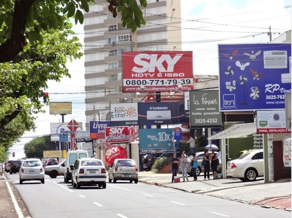
In 2006, São Paulo introduced a law called Lei Cidade Limpa, which banned outdoor advertising and resulted in 15,000 billboards being taken down. The mayor at the time, Gilberto Kassab explained that
“The Clean City Law came from a necessity to combat pollution … pollution of water, sound, air, and the visual. We decided that we should start combating pollution with the most conspicuous sector – visual pollution.”
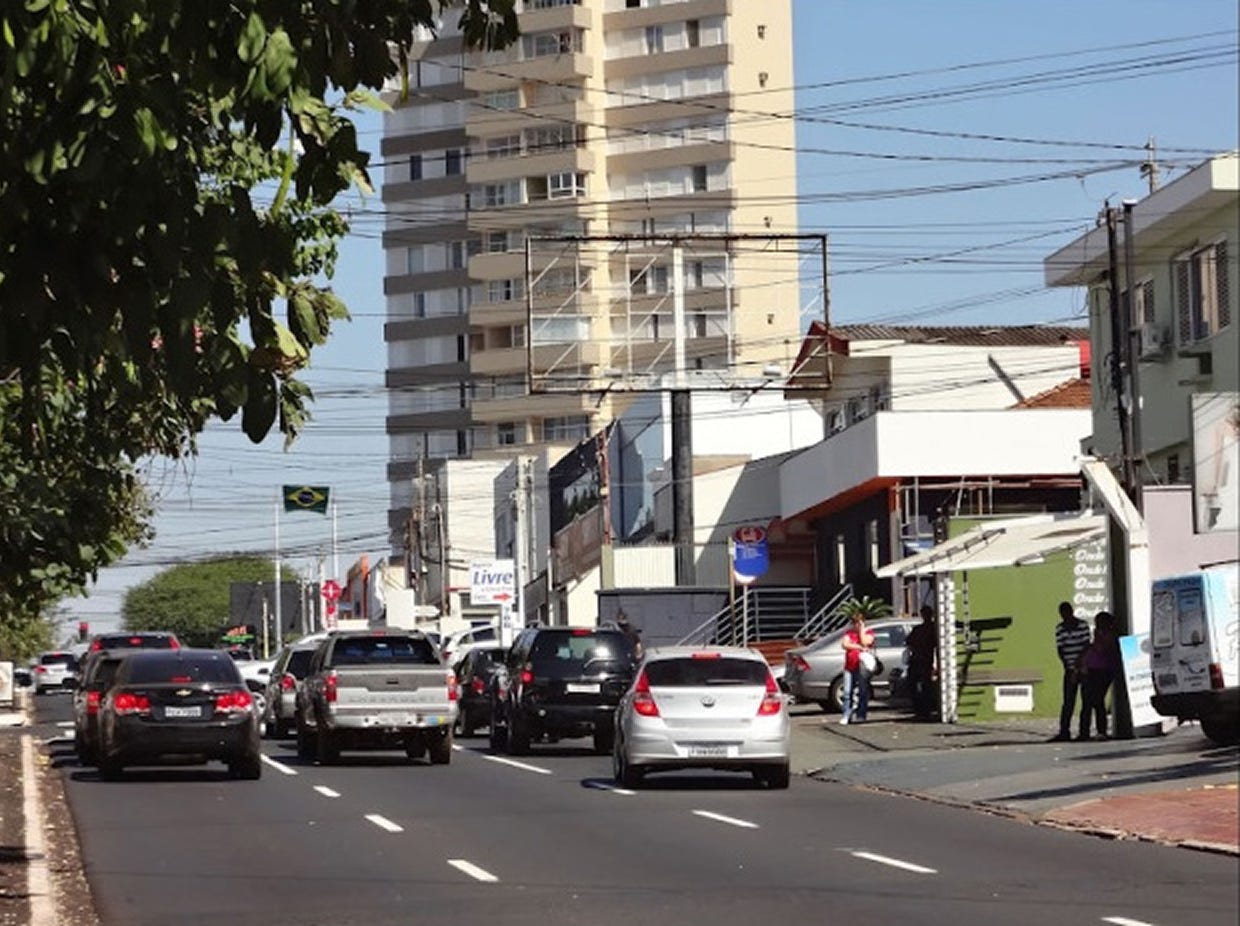
Residents found a new appreciation for their city, remarking that they hadn’t noticed many of the building’s architectural features when they were distracted by ads. Property values increased, graffiti art flourished in designated areas, and the city’s architectural heritage became visible again. The removal of visual noise allowed the underlying Gestalt principles of the city’s design to re-emerge.
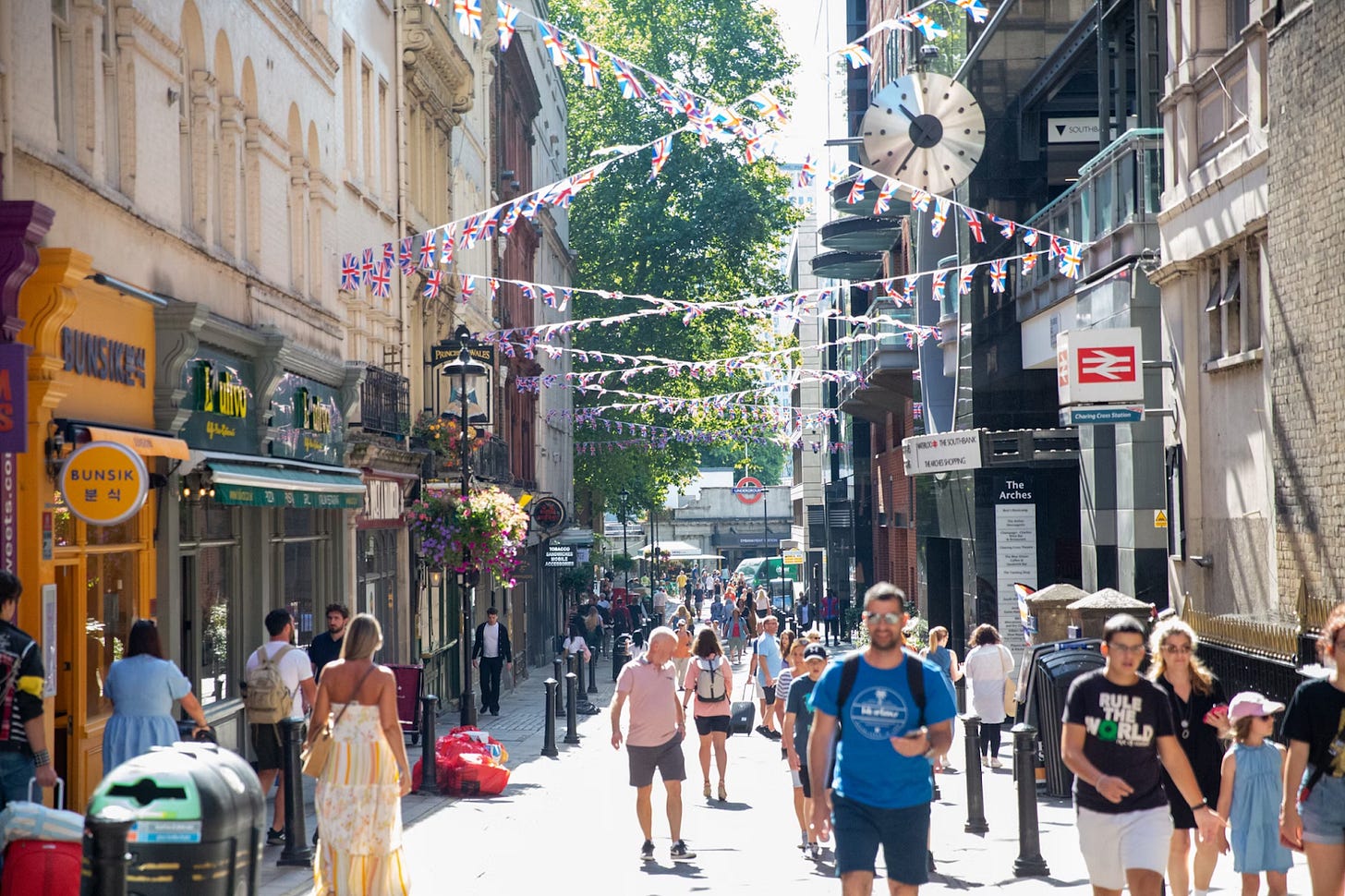
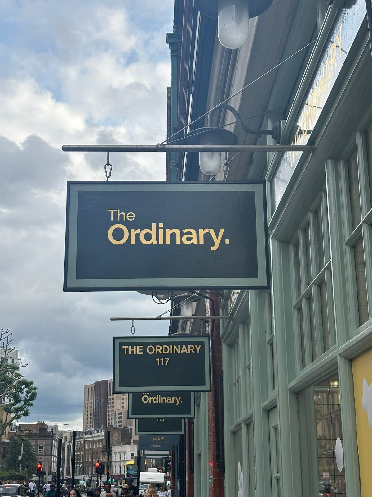
On Lamb Street beside Spitalfields Market in London, the shopfronts stand out for their understated uniformity. Even new companies adopt signage that is restrained in colour, scale, and material, producing a rare sense of coherence in a contemporary retail street. Traders at the market are also required to use clear, durable, and well-crafted branding, which naturally discourages the kind of glare-heavy plastics and oversized fonts that dominate elsewhere. This street demonstrates how continuity of signage can support Gestalt principles of similarity and closure, guiding the eye smoothly along the facades while still leaving room for individual identity.
These interventions work because they respect how our brains process visual information. They create similarity where there was chaos, establish clear figure-ground relationships where there was confusion, and enable our natural tendency to group and simplify.
When we design with perception in mind, we create urban spaces that feel as natural to navigate as they are necessary to inhabit, constructing cities that welcome our minds as readily as they shelter our bodies.


Excellent piece Eleanor!
https://open.substack.com/pub/danlewis8/p/the-most-beautiful-neighbourhoods?r=grzc0&utm_medium=ios
It overlaps a lot with what i wrote about the most beautiful neighbourhoods in the world, and I see we chose quite a few of the same examples, even the same Kyoto shot!
Beautifuly done connecting perceptual psychology to somthing as tangible as streetscapes. The São Paulo example really underscores how these principles aren't just academic, theyre cognitive load management in practice. Its facinating that removing billboards didn't just clean up the view but actually revealed architectural coherence that was always there, like lifting static off a signal.